
Introduction
We live in an era of big data, where numbers and statistics flood our screens daily. But raw data alone isn’t useful — it needs to be visualized to be understood.
That’s where spatial data visualization comes in. By turning location-based data into maps, heatmaps, and interactive dashboards, GIS professionals can reveal hidden patterns, make better decisions, and tell compelling stories.
In this article, we’ll explore:
✅ Why spatial data visualization matters
✅ The best ways to visualize spatial data
✅ Tools for effective GIS mapping
✅ Common mistakes to avoid
1️⃣ Why Spatial Data Visualization Matters
A well-designed map can simplify complex data, helping users quickly grasp insights that tables and reports can’t convey.
📌 Benefits of Spatial Data Visualization:
✅ Improves Decision-Making — Businesses use maps to optimize store locations.
✅ Reveals Patterns & Trends — Crime heatmaps show high-risk areas.
✅ Enhances Communication — Governments use maps for disaster response.
✅ Engages & Educates Audiences — Climate change maps inform the public.
💡 Example: A retail chain uses GIS heatmaps to identify high-foot-traffic areas, helping them place new stores in prime locations.
2️⃣ Best Ways to Visualize Spatial Data
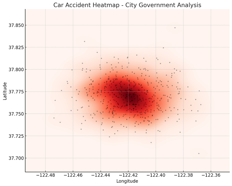
🔹 1. Heatmaps (Density Maps)
Heatmaps use color gradients to highlight areas of high or low concentration.
📊 Best for:
- Customer foot traffic analysis
- Crime hotspot mapping
- Environmental changes (air pollution, deforestation)
💡 Example: A city government uses heatmaps to pinpoint areas with the most car accidents, helping them improve road safety.
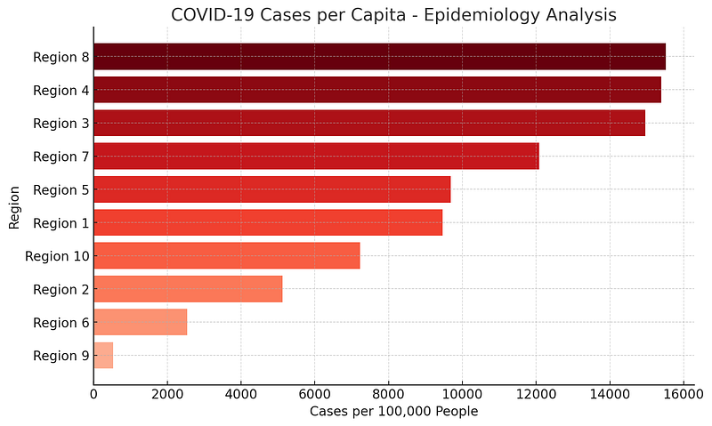
🔹 2. Choropleth Maps (Color-Coded Maps)
Choropleth maps use different shades of color to represent data values across regions.
📊 Best for:
- Population density visualization
- Election results (red vs. blue states)
- Income distribution
💡 Example: A public health agency creates a COVID-19 case distribution map, using darker shades for areas with higher infections.
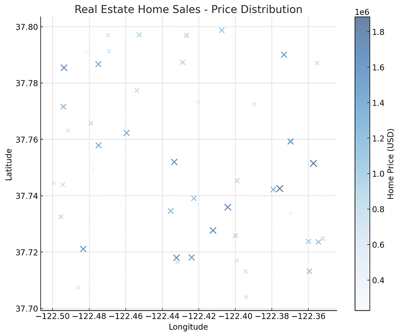
🔹 3. Proportional Symbol Maps
Instead of colors, symbol sizes represent data values (e.g., larger circles for bigger populations).
📊 Best for:
- Mapping store locations by revenue
- Visualizing earthquake magnitudes
- Showing business market share
💡 Example: A real estate firm maps home sales using larger circles for higher-value properties.
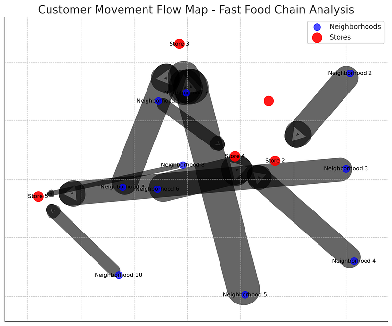
🔹 4. Flow Maps (Movement & Migration Patterns)
Flow maps use arrows or lines to show how people, goods, or data move.
📊 Best for:
- Migration trends
- Trade route analysis
- Supply chain logistics
💡 Example: A fast-food chain maps customer movement from home neighborhoods to store locations to understand shopping behavior.
🔹 5. 3D GIS & Digital Twins
3D GIS allows users to analyze spatial data in three dimensions, making it useful for:
📊 Best for:
- City planning (visualizing building heights)
- Underground infrastructure mapping
- Environmental impact analysis
💡 Example: A city planner uses 3D GIS to simulate urban expansion, helping them plan better zoning policies.
3️⃣ Tools for Effective Spatial Data Visualization
ArcGIS Pro (Best for Professional Mapping)
🔹 Industry-standard GIS software for high-quality maps.
🔹 Supports 3D visualization, spatial analytics, and real-time mapping.
QGIS (Best Open-Source Alternative)
🔹 Free GIS tool for choropleth maps, heatmaps, and spatial joins.
🔹 Works with various spatial data formats.
Python (For Automated Mapping & Interactive Visualizations)
🔹 Folium — Creates interactive web maps.
🔹 Matplotlib & Geopandas — Custom data-driven maps.
🔹 ArcPy — Automates map creation in ArcGIS Pro.
Example: Creating an Interactive Web Map with Python (Folium)
import folium

# Create a basic map centered on New York City
m = folium.Map(location=[40.7128, -74.0060], zoom_start=12)


# Add a marker for a store location
folium.Marker([40.730610, -73.935242], popup="Store A").add_to(m)


# Save map as HTML
m.save("map.html")
print("Interactive map created successfully!")
✅ Result? A clickable, interactive web map showing store locations.
4️⃣ Common Mistakes to Avoid in Spatial Data Visualization
❌ Using Too Many Colors — Makes maps hard to read.
❌ Ignoring Projection Issues — Wrong coordinate systems lead to distortion.
❌ Overloading with Data — Keep maps simple & focused.
❌ Lack of Context — Provide legends and labels to guide viewers.
💡 Example: A poorly designed population density map with random colors can confuse readers instead of informing them.
Conclusion: The Power of Spatial Data Visualization
Effective spatial data visualization turns raw location data into actionable insights.
✅ Heatmaps reveal density patterns.
✅ Choropleth maps simplify comparisons.
✅ 3D GIS enhances city planning.
✅ Python automates interactive mapping.
🔗 Useful Resources & Links
- 📊 Learn ArcGIS Visualization Tools
- 🗺 QGIS Heatmap Tutorial
- 🎥 Python GIS Visualization Tutorials
Originally published on Medium.